SECONDARY Section 3 Part 1: Meet the Illustrator
“I hope that people put these up and then those messages will be read every day – that’s the whole point, that’s what I love about posters – they keep giving.”
– Steph Hughes.
Activity:
After watching the film, read through the quotes from Steph below. In your design diary, document and explain the design practice of Steph Hughes across a double page. You should include images of her work and also outline her world by making notes on her ideas, cultural values, intentions and choices when creating illustrations and designs. Lay up this double page of research in a visually engaging way that appropriates Steph Hughes’ style. You can use the links provided in this education resource to find out more about the designer.
Core reading: Who is Steph Hughes?
“I started drawing before I can remember it being a conscious decision to draw. I’ve always felt pretty compelled to do it – so have always drawn on every bit of scrap paper I’ve had around me, until the textas ran out…”
– Steph Hughes
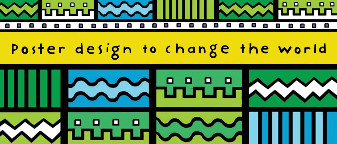
Steph Hughes’ design practice is defined by her playful and humourous style, her use of flat bold colour and pattern and her ability to create images that are simultaneously quirky and accessible.
Steph Hughes’ style and the Oxfam posters
“I got a call from Oxfam saying we’ve got these goals to change the world, we’d love for them to be illustrated in a way that you think would be fun. There’s going to be six posters, all individually with one of the goals on them, so go from there! Which was overwhelmingly fun for me to work out.”
– Steph Hughes
In 2015, Hughes was commissioned to design a series of six posters to promote Oxfam’s six goals to change the world. Steph designed these posters so they can printed in full colour or can be used as colouring-in sheets for Oxfam Australia.
She regularly designs posters and merchandise for bands and organisations and creates websites, graphics, T-shirts and illustrations. She also makes music: playing drums, guitar, piano and singing in her very successful Australian band, Dick Diver. When she is not making art or music she is talking about it as a presenter on the ABC’s national youth radio station, Triple J.
“Initially I just had to come up with a way to convey that message as strongly and simply as possible. That’s where I had a bit of a flash of this layout that we’ve ended up with… with the heading and then this kind of puzzle-like patchwork of imagery and symbols and … then the writing down the bottom. There was quite a lot of back and forth … and then slowly, as I talked to Oxfam more, we would add in more symbols – suggestions they had, suggestions I had.”
– Steph Hughes
Each poster acts as a symbolic system to be decoded by audiences. Hughes has created a visual language to explore each goal. Each poster is composed according to a unique grid pattern that combines text and graphics that can be literal or, at times, deliberately polysemic.
Some of the small individual images on each poster might be seen to have multiple meanings and are open to interpretation by the audience. As a whole, each poster contributes to the exchange and circulation of ideas surrounding each goal.
“People’s eyes go to pictures often instead of big bodies of words – it’s an easily translatable thing – it’s multi-language, it goes beyond one specific place, it’s multi-age, and it’s just nice for your eyes to see an illustrated picture instead of reading fine print. It’s a universal language.”
– Steph Hughes
Hughes has a style that is reminiscent of Reg Mombassa’s early work for clothing company Mambo. The eyes and mouths of Hughes’ figures appear to appropriate those used in his familiar and iconic style. Hughes has a playful approach and her culturally diverse figures are drawn in a deceptively simple manner, often in profile, usually smiling.
Each one is outlined heavily and surrounded by repeated patterns and shapes. This suited the original brief; that the posters work as colouring-in sheets as well as stand alone campaign posters, and also reflects much of the designer’s own style. Hughes makes work that appears busy and that rewards the viewer who looks for detail.
Her works often seem to have a story to tell. The posters she has designed for Oxfam successfully combine these characteristics.
“The difference between a poster in general and a campaign poster with this much … message is that – we had a really clear thing to translate in each goal to change the world, we had an individual goal that we had to get across to the viewer.”
– Steph Hughes
Further Reading on Steph Hughes:
- The designer’s own website
- Map and website for the fifth annual Golden Plains Music Festival
- Tram Design
- Illustrations for Bosch
- Website and Program Design (including Hughes’ own appropriation of the classic ‘Rosie the Riveter’ poster)