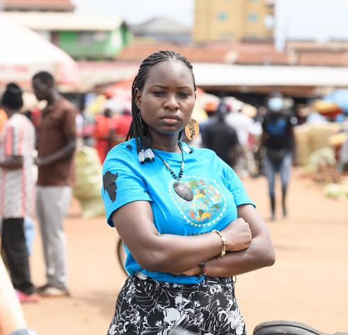
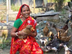
Uganda: Member of CIVACT Youth group- Nabatanzi Stella and Zuwena Khalil weed the pop up gardens at the group demonstration garden in Kitintale, Kampala. Photo: Philip Makaka/Oxfam
Get involved
Together, let's build a world without poverty
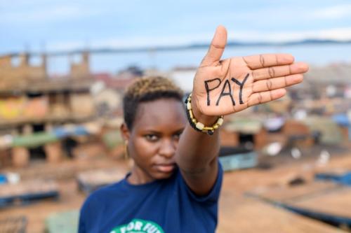
Uganda: Hilda Flavia Nakabuye is based in Kampala and founder of Fridays for Future in Uganda. Photo: Emmanuel Museruka/Oxfam
what you can do
You have the power to change what’s possible.
For more than 80 years, Oxfam and our supporters have stood with communities facing poverty, inequality and crisis and challenged the systems that held them back. We know a fairer world is possible — and we know you agree.
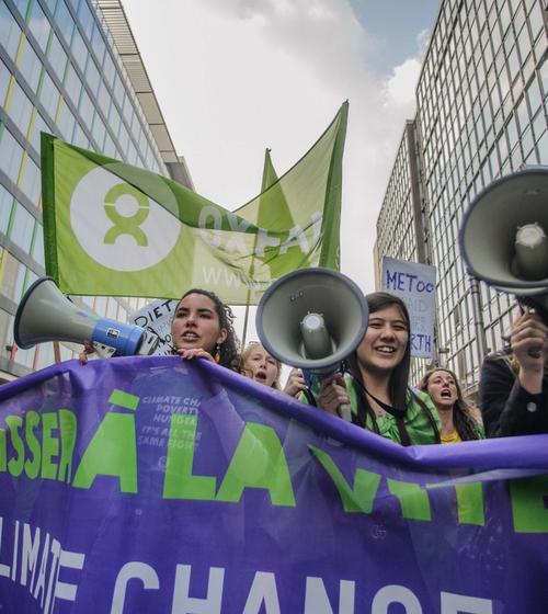
Inequality cannot grow when people like you choose to stand against it. Together with Oxfam and our supporters all over the world, you can help create a future where everyone is equal and no one has to live in poverty.
Whether you sign a petition, donate, volunteer or attend an event, your support helps us create a fairer, more equal world.
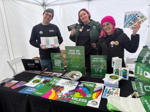
How you can help
Join Oxfam today and help tackle the inequalities that keep people in poverty.
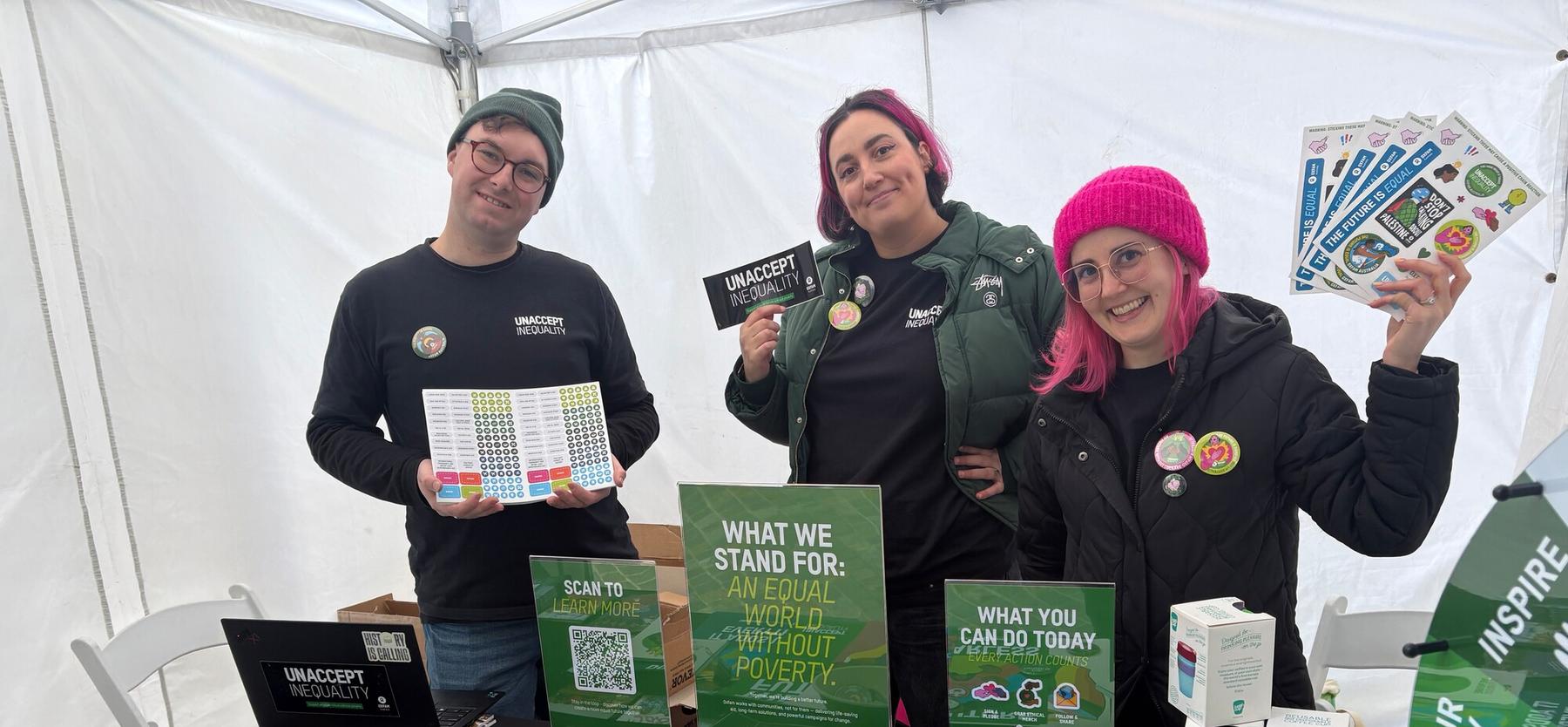
Australia: Oxfam Australia staff attended a event as part of Orientation Week at the University of Melbourne. Oxfam was present at this event to talk about Oxfam, our work and to engage with students and the community. Photo: Maddison Kraus/Oxfam
Your donation supports livelihoods and life-saving aid, helping tackle inequality and poverty for a fairer world.
Stay up to date with our news, programs and appeals.